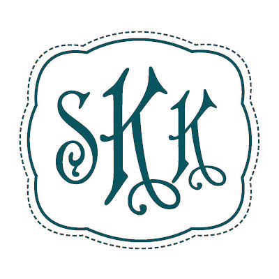
Like any good communications professional, I am absolutely determined to brand our wedding. As with our events, I wanted a unifying element to plaster on anything I can get my hands on; a logo, if you will, to let people know they're viewing an official Sheila-Kevin wedding document. :)
I got this bright idea to ask my Matron of Honor to help me bring my ideas to life. Convenient that she's a graphic artist beginning her own free lance biz, huh?
The shape of the outline of the monogram is the same shape you might recognize from our Save the Dates (if you received one, of course). The color of the logo is made to match the bridesmaid. The letters of the monogram itself, well, that's a funny story. I was tossing around quite a few fonts on my screen. Sending them back and forth to Laura to see what she thought. After sending Laura an email with this font and a couple others, I came upon Southern Proper Monograms. In a mouseclick that seemed like destiny, I discovered that this company only sells two different fonts of their large wooden cut-out monograms... A loopy, fancy schmancy font, and this one! I knew then that it was fate that I'd already found this font earlier and sent it to Laura. Before she even had a chance to look at the other fonts, I'd ordered the wooden cut-out and replied to my own previous email letting her know of my selection.
There will be a few other variations of the logo, one featuring the date, another in a different color, etc. But the concept will remain the same.
I hope you like it!


So cute!!! I'm getting excited for October!!
ReplyDelete